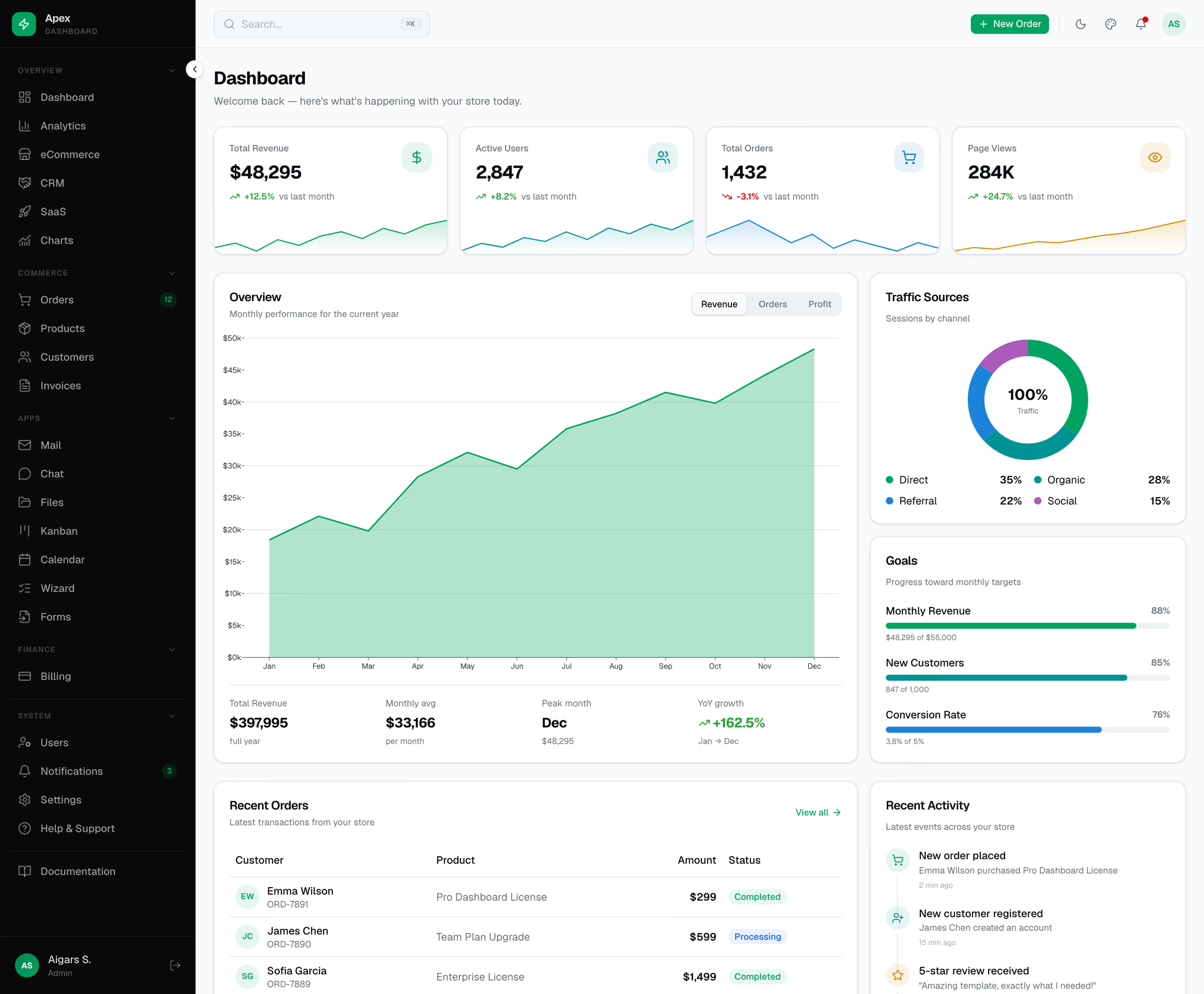
Apex Dashboard — Svelte Edition
Apex Dashboard — Svelte Edition
Price range: $69.00 through $349.00
A premium SvelteKit 3 + Svelte 5 admin dashboard with 39 pages, shadcn-svelte primitives, LayerChart charts, dark mode, i18n (en/de/fr), a ⌘K command palette, a live theme customizer, drag-and-drop Kanban, and interactive tables and demo workflows. Tailwind CSS 4, TypeScript, Storybook — type-checked with zero warnings and ready to brand.
Description
Apex Dashboard — Svelte Edition
A premium admin dashboard template built with SvelteKit 3, Svelte 5 (runes), TypeScript, and Tailwind CSS 4. The Apex design system — OKLCH color tokens, a dark sidebar, an emerald primary, and Geist typography — ported to Svelte and wired up with 39 demo pages, interactive data tables, live charts, and a component library on Storybook. Type-checked end to end, zero build warnings, and ready to brand.
Why Apex Svelte?
- 39 routes, prerendered demo pages — sample data included; real authentication, payments, and persistence require backend integration, so it runs the moment you
npm run dev - shadcn-svelte primitives on bits-ui — button, card, dialog, dropdown, popover, sheet, table, tabs, select, and 15+ more, vendored as source you own and can restyle
- Interactive demo workflows — reactive commerce tables, a New Order dialog, drag-and-drop Kanban, a ⌘K command palette, and a live theme customizer
- Storybook included — browse the component library with the Apex tokens applied
Pages & Modules
- Dashboards — Overview, Analytics, eCommerce, CRM, SaaS, and a Charts gallery
- Commerce — Orders, Products, Customers, and Invoices, each a reactive data table with search, filters, status pills, and row actions
- Apps — 3-pane Mail client, live Chat, Files manager, drag-and-drop Kanban, and a month Calendar
- Forms — multi-step Wizard, a form-controls showcase, tabbed Settings, Profile, and Pricing
- System — Users & roles, Notifications, Billing, Help & Support, and in-app Docs
- Auth — login, register, forgot / reset password, two-factor, verify-email, and lock-screen
- Status — 403, 500, coming-soon, and maintenance
Interactions
- ⌘K command palette — global shortcut and header search, quick actions plus jump-to-page navigation
- Theme customizer — live accent presets, corner radius, light/dark/system, sidebar state, content width, and density; persisted to localStorage via CSS-variable overrides
- Create / edit / view modals — the New Order dialog is wired to a shared reactive store so new records appear instantly in the table and on the dashboard; connect the demo store to your backend for persistent records
- Kanban drag-and-drop — move cards between columns with live counts
- Internationalization — English, German, and French navigation labels, switchable at runtime and persisted
Design & Theming
- Tailwind CSS 4 with an OKLCH token system — semantic tokens for primary, card, muted, sidebar, chart-1…5, success, warning, and destructive
- Dark and light modes out of the box via mode-watcher, respecting system preference
- Self-hosted Geist & Geist Mono fonts, refined scrollbars, and tasteful motion
- Density modes — compact, comfortable, and spacious — driven by CSS variables
Charts
- LayerChart 2 (D3-based) area and bar charts with tabbed series, formatted axes, and themed tooltips
- Hand-rolled SVG sparklines and donut charts for exact color control and zero extra dependencies
Developer Experience
- Svelte 5 runes throughout —
$state,$derived,$effect,$props, snippets — no legacy store boilerplate - Strict TypeScript —
svelte-checkpasses with zero errors and zero warnings - Storybook — component stories for Button, Badge, Card, and StatCard with Tailwind tokens applied
- Static-deploy ready — build for any host, at the root or a subpath, with the included base-path support
- Clean architecture —
#libaliases, shared UI primitives, rune-based stores, and a typed i18n layer
Tech Stack
| Framework | SvelteKit 3 + Svelte 5 (runes API) |
| Language | TypeScript |
| Styling | Tailwind CSS 4 (OKLCH) + shadcn-svelte + tw-animate-css |
| UI primitives | bits-ui + tailwind-variants |
| Charts | LayerChart 2 (D3-based) + hand-rolled SVG |
| Icons | @lucide/svelte |
| Dark mode | mode-watcher |
| i18n | Custom rune-based locale store (en / de / fr) |
| Fonts | Self-hosted Geist & Geist Mono (@fontsource) |
| Storybook | @storybook/sveltekit |
| Build | Vite + @sveltejs/adapter-auto / adapter-static |
Current Release & Setup
Version 1.3.0 uses SvelteKit 3, Svelte 5, Vite 8, and TypeScript 6. Requires Node.js 22.17+ (Node.js 24 LTS recommended) and npm 11.19.1. Includes active sidebar navigation, updated setup and deployment documentation, and 42 Playwright checks at the root and a deployment subpath.
The 39 demo pages prerender for static hosting. Storybook 10.6 provides component examples. Authentication screens and sample data require your backend integration for production accounts and payments.
Additional information
| License Type | Personal License, Developer License, Lifetime Developer License |
|---|
Related products
-
Sales Dashboard
Price range: $69.00 through $349.00 Select options This product has multiple variants. The options may be chosen on the product page -
Apex Dashboard — Next.js 16 Admin Template
Price range: $69.00 through $349.00 Select options This product has multiple variants. The options may be chosen on the product page -
Haze Dashboard — Next.js Edition
Price range: $69.00 through $349.00 Select options This product has multiple variants. The options may be chosen on the product page -
Analytic Dashboard
Price range: $69.00 through $349.00 Select options This product has multiple variants. The options may be chosen on the product page