Haze Dashboard — Next.js Edition
Haze Dashboard — Next.js Edition
Price range: $69.00 through $349.00
A premium Next.js 16 admin dashboard with React 19, shadcn/ui on Radix primitives, Tailwind CSS v4, and recharts. 96 pages across 5 dashboards, full CRUD on 6 resources, 8 interactive apps (chat / mail / kanban with @dnd-kit / calendar / files / Tiptap editor / Leaflet map / charts), 11 auth flows in 3 layouts, role-based UI gating, mock REST API with pagination/search/filter, next-intl i18n (en/de/fr), 6 accent presets, light/dark/RTL, 14-page docs site.
Description
Haze Dashboard — Premium Next.js 16 Admin Template
A premium admin dashboard built with Next.js 16 (App Router + Turbopack), React 19, shadcn/ui on Radix primitives, Tailwind CSS v4, and recharts. 96 pages across 5 dashboards, full CRUD on 6 resources, 8 app modules, 11 auth flows, a 14-page in-app docs site, and a mock REST API with pagination/search/filter — production-build green and ESLint-clean from the first commit.
Why the Next.js Edition?
- Next.js 16 App Router + Turbopack — file-system routing, route groups, server components by default, React 19 actions, dynamic
paramsas Promises, fast dev rebuilds - Tailwind CSS v4 with OKLCh tokens — perceptually-uniform colors that work in light and dark with no token duplication
- shadcn/ui (radix-nova preset) — 27 vendored Radix-based primitives, fully customizable, copy-paste ownership
- Public Sans + JetBrains Mono via next/font — matches the Minimals-inspired Haze typography
- Server components for docs + landing — smaller bundle, faster TTFB; client components only where interactivity demands it
- No new dependencies surprises — every library matches what the Nuxt source uses (Tiptap, Leaflet, dnd-kit, recharts, Zustand)
5 Dashboard Variants
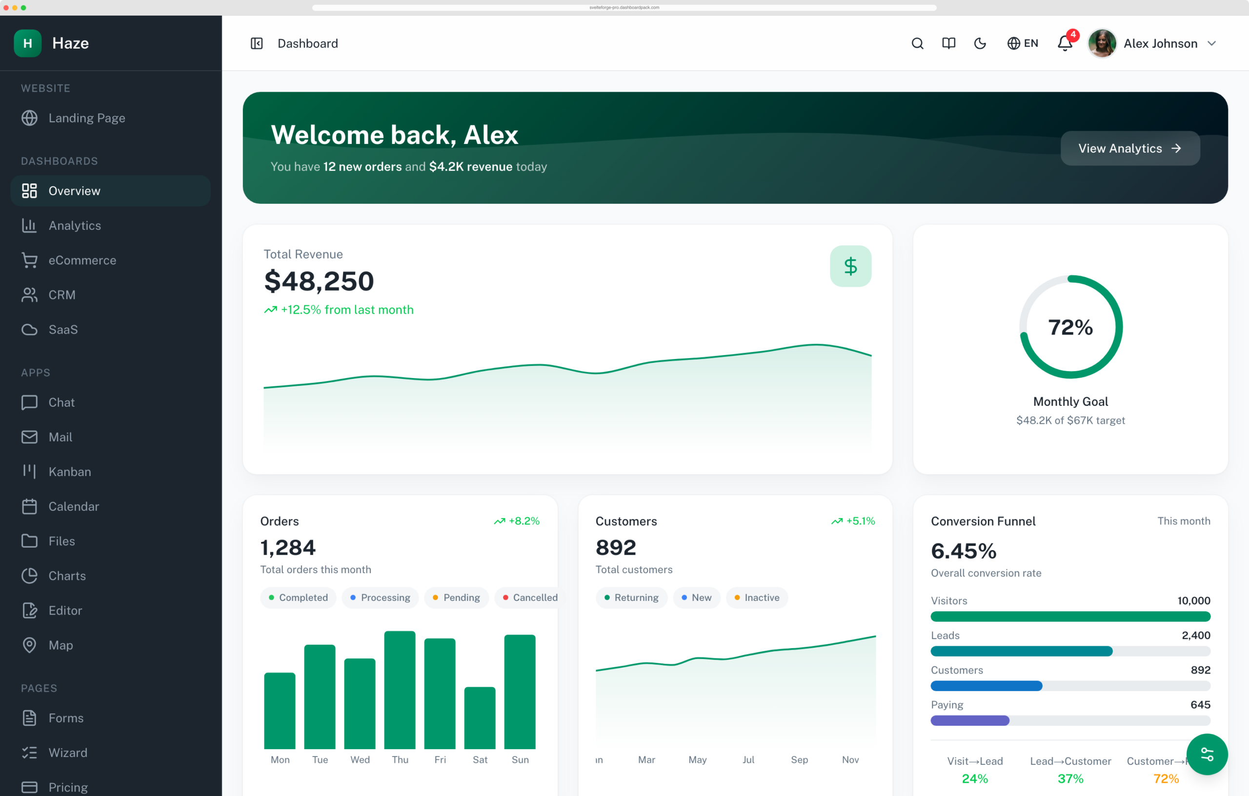
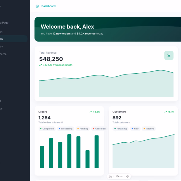
- Overview — Welcome banner, revenue sparkline, interactive order/customer breakdowns with status filters, conversion funnel, top products, activity timeline
- Analytics — Traffic chart with 7d/30d/90d period switcher, bounce-rate gauge, duration ring, session bars, channel breakdown, device donut, top pages, geographic traffic with flags
- eCommerce — Revenue hero with sparkline + AOV/orders/refunds side metrics, 4-stage order pipeline with connector chevrons, sales-by-category bars, top products with ratings, recent orders table
- CRM — 5-stage funnel with gradient stages, win-rate semi-circle gauge, deals/avg-deal-size cards, top deals with progress, sales team leaderboard with performance overlay, lead sources with conversion overlay
- SaaS — Gradient MRR hero with embedded sparkline, ARR + active-subs stacked bar + churn sparkline + LTV cards, subscription tier cards, new/churned user growth area chart, churn reasons, recent trials
Full Commerce CRUD (24 Pages)
- Orders — Paginated list with search + status filter, detail view, create + edit forms with react-hook-form + Zod, delete confirmation
- Products — Same CRUD trio, with category and stock fields, image URL support
- Customers — List with avatar initials, profile with contact info, full edit form
- Invoices — List, detail with line items, create + edit with
useFieldArrayfor line items, printable invoice page - Users — Team list with avatar + role badge, profile, full edit
- Roles — Card grid (not paginated table), create/edit with permission checkbox matrix (resource × action)
- Role-based UI gating —
usePermission()selector hides action buttons for viewer-role users
11 Authentication Pages (3 Layouts)
- 3 visual styles — Classic centered card, dark cover with glass overlay + decorative orbs, split-screen branding + form
- Login + Register on each layout — 6 pages total
- Forgot password, Reset password, Verify email, Two-factor (6-digit + backup code), Confirm password
- react-hook-form + Zod on every form via shared
<FormField>wrapper - Sonner toasts for success/error feedback throughout
- 3 demo personas — admin / editor / viewer @haze.dev — log in as each to see permission-gated UI
8 Interactive App Modules
- Chat — 3-pane layout: contacts with search + unread badges, message thread with auto-scroll, compose footer
- Mail — Folder rail + mail list + reader pane with reply/forward/trash, compose dialog, star toggle
- Kanban — 4 columns (To Do / In Progress / Review / Done) with @dnd-kit sortable cards, cross-column drag, priority badges
- Calendar — Vanilla-Date month view (Monday start, 42-cell grid), events bucketed in a useMemo Map, click-cell to create, click-event to view
- Files — Left rail with Storage + folder list, breadcrumb + search + sort + grid/list toggle, type-tinted file thumbnails, dropdown actions
- Charts — 6-chart showcase using recharts: Line, Area, Bar, Stacked Bar, Donut, Multi-Line
- Editor — Tiptap v3 React with full toolbar (B/I/U/S, H1-3, lists, quote, code, link, image, align L/C/R/J, undo/redo), live HTML output card, word/char count
- Map — react-leaflet via
next/dynamic { ssr: false }, sample markers with popups, sidebar location list with flyTo
Account & Settings
- Profile multi-tab — Overview with About + Recent Posts + Skills + Social Links, Activity timeline, Connections with Follow/Following, Gallery with category filter (masonry grid)
- Settings multi-tab — Profile (avatar + form + danger zone), Password, Appearance (color mode + 6 accent presets + density + RTL + language), Two-factor (Switch-gated 3-step flow with QR placeholder + backup codes)
Utility Pages
- Pricing — Monthly/Annual Switch, 3 tiers with “Most Popular” highlight, feature comparison table
- Billing — Current plan + usage bar, payment methods, recent invoices, danger-zone Cancel
- Notifications — Full list grouped by Today/Yesterday/Earlier, All/Unread filter, mark-all-read
- Support — FAQ accordion + contact form via react-hook-form + Zod
- Forms showcase — 8 sections covering every shadcn input + a final RHF + Zod validated form
- Wizard — 4-step form (Account → Company → Preferences → Review) with per-step
trigger()validation - Components gallery — 12 sections covering Buttons, Badges, Avatars, Alerts, Tooltips, Progress, Tabs, Accordion, Modal/Drawer, Skeleton, Breadcrumbs, Pagination
- Timeline — Center-spine alternating layout on md+, dot inline on mobile
- Shop — Product grid, detail with related products, cart with quantity controls, multi-section checkout
5 Built-In Layouts
- Sidebar (default) — Collapsible dark sidebar with grouped nav, sticky header with breadcrumbs + ⌘K command palette
- Horizontal — Top nav with grouped dropdowns, mobile slide-over menu
- Auth × 3 — Plain centered card, dark cover with gradient orbs, split branding/form panel
- Blank — Centered child only (errors, coming-soon, maintenance)
- Marketing — Landing nav + footer (about, blog, contact, FAQ, pricing)
- Docs — Top bar + docs sidebar + main content (14-page docs site)
Live Theme Customizer
- 4 sections — Color mode (light/dark/system), 6 accent presets (teal/blue/purple/orange/rose/emerald), Density (compact/default/spacious), Direction (LTR/RTL)
- Live preview across the whole app — every change writes to CSS variables on
<html>at runtime - 3 locales via next-intl — English, German, French. Cookie-based (no URL prefix), matches the Nuxt source’s
no_prefixstrategy - Persisted to localStorage — buyer preferences survive reload
- Floating ⚙️ trigger bottom-right opens a Sheet drawer
Mock API Layer (33 Routes)
- Next.js Route Handlers in
src/app/api/reading fromsrc/server/data/*.json - Generic CRUD factories in
src/lib/server/crud.ts— each resource’sroute.tsis 2–4 lines - Pagination helper supports
?page=,?per_page=,?search=,?status=,?sort=,?order= - Zod validators per resource — every POST/PUT validated, errors returned with field paths
- 17 JSON datasets seeded — orders, products, customers, invoices, users, roles, notifications, mail, chat-messages, calendar-events, files, kanban, 5 dashboard variant datasets
- Swap for a real backend by replacing the JSON imports in
src/app/api/*/route.tswith fetches; the pagination/Zod scaffolding is reusable
Developer Experience
- 27 shadcn primitives vendored under
src/components/ui/— accessible, headless, fully customizable - 9 shared components — DataTable, PageHeader, EmptyState, StatusBadge, GlassCard, StatsCard, ConfirmDialog, ProfileHeader, FormField
- Zustand stores for sidebar / auth / notifications / theme settings — small, hook-based, Pinia-style ergonomics
- react-hook-form + Zod on every form via shared
<FormField>wrapper - Sonner toasts theme-tracked via
useThemeSettings - 14-page in-app docs site at
/docs— getting started, folder structure, theming, layouts, adding pages, components, charts, i18n, mock API, authentication, testing, deployment, changelog
Tech Stack
| Framework | Next.js 16 (App Router + Turbopack) |
| Runtime | React 19 |
| Language | TypeScript 5 (strict mode) |
| Styling | Tailwind CSS v4 with OKLCh design tokens + tw-animate-css |
| Components | shadcn/ui (radix-nova preset) — 27 vendored Radix primitives |
| Icons | lucide-react + inline brand SVGs (GitHub / LinkedIn / X) |
| Charts | recharts |
| Forms | react-hook-form + @hookform/resolvers + Zod 4 |
| State | Zustand (with persist middleware for theme + sidebar) |
| Toasts | sonner |
| Rich Text | Tiptap 3 (React) with starter-kit + link/image/placeholder/text-align/underline |
| Maps | react-leaflet via next/dynamic ssr:false |
| Drag & Drop | @dnd-kit/core + sortable + utilities |
| i18n | next-intl (cookie-based, no URL prefix) — en / de / fr |
| Mock API | Next Route Handlers + JSON files + generic CRUD factories |
| Build | Next 16 Turbopack production build |
| Package manager | npm (pnpm + yarn supported) |
Additional information
| License Type | Personal License, Developer License, Lifetime Developer License |
|---|
Related products
-

Lifetime Access & Support Club Pass for All Themes
Price range: $495.00 through $795.00 Select options This product has multiple variants. The options may be chosen on the product page -
Haze Dashboard — Nuxt Edition
Price range: $69.00 through $349.00 Select options This product has multiple variants. The options may be chosen on the product page -
Vault Dashboard
Price range: $69.00 through $349.00 Select options This product has multiple variants. The options may be chosen on the product page -
Apex Dashboard Laravel
Price range: $69.00 through $349.00 Select options This product has multiple variants. The options may be chosen on the product page