Description
Apex Dashboard — Svelte Edition
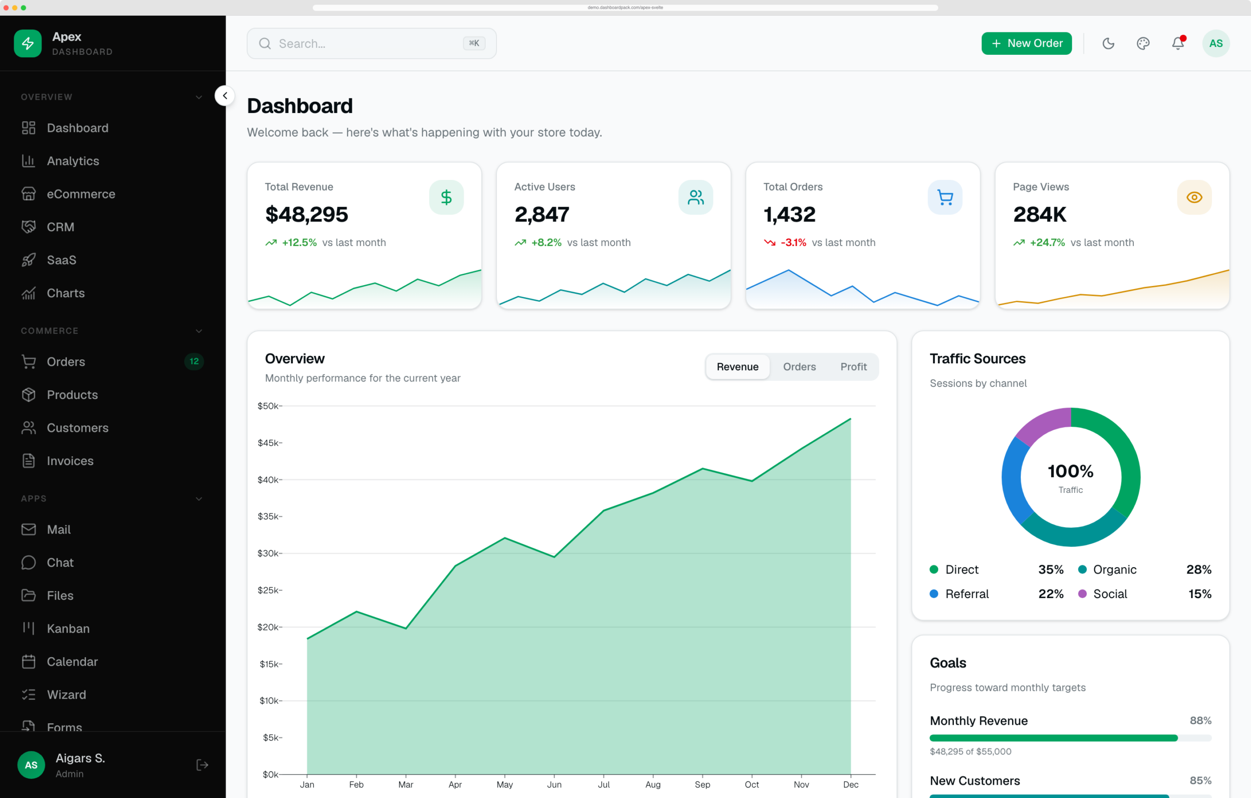
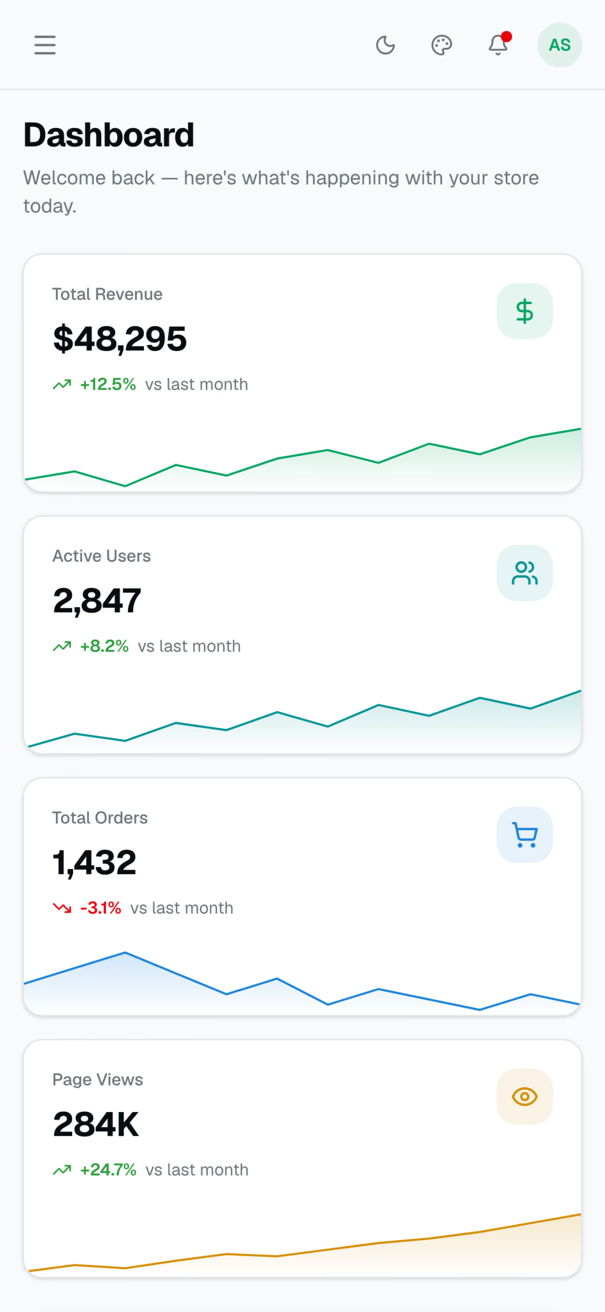
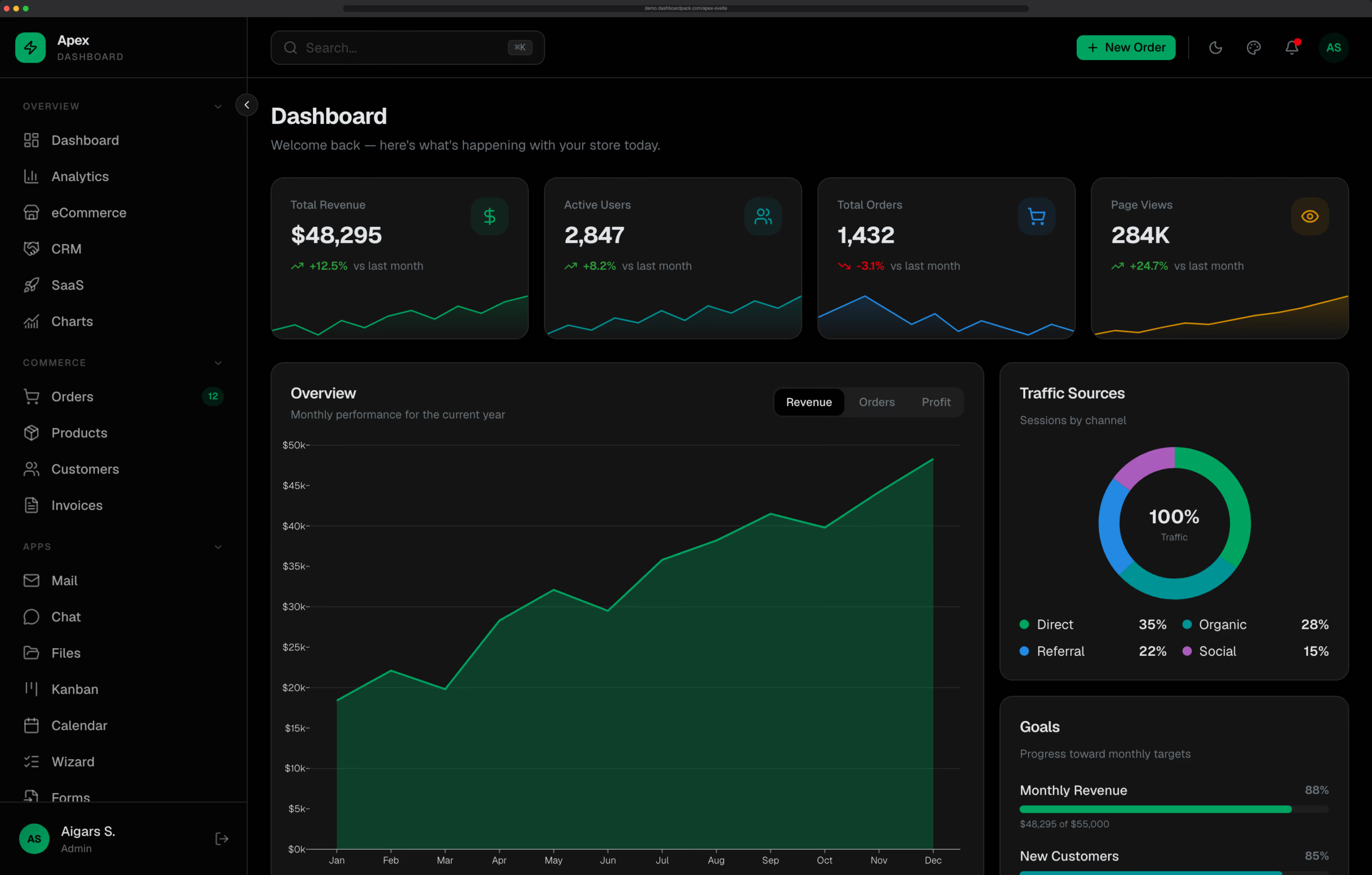
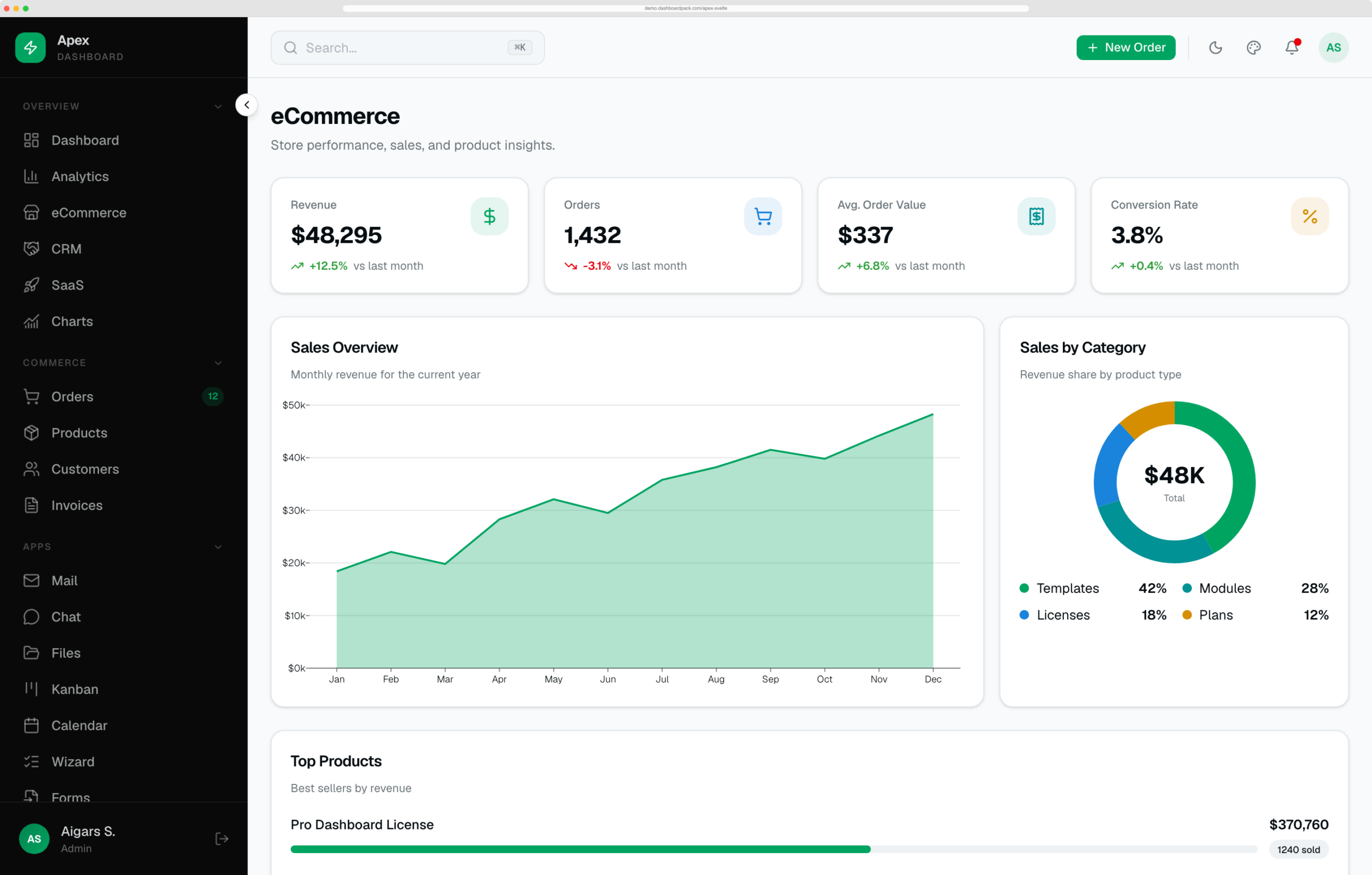
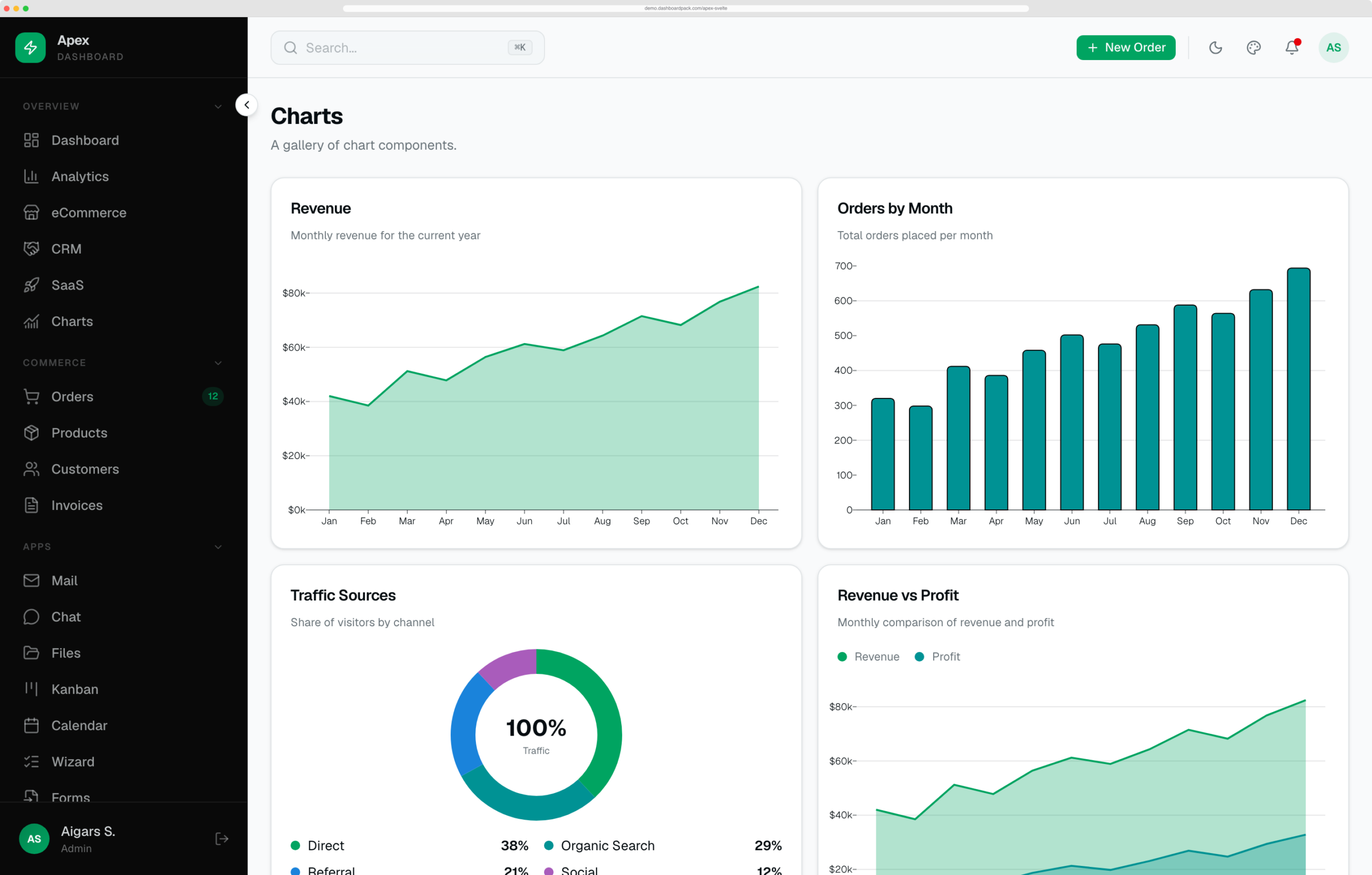
A premium admin dashboard template built with SvelteKit 3, Svelte 5 (runes), TypeScript, and Tailwind CSS 4. The Apex design system — OKLCH color tokens, a dark sidebar, an emerald primary, and Geist typography — ported to Svelte and wired up with 39 demo pages, interactive data tables, live charts, and a component library on Storybook. Type-checked end to end, zero build warnings, and ready to brand.
Why Apex Svelte?
- 39 routes, prerendered demo pages — sample data included; real authentication, payments, and persistence require backend integration, so it runs the moment you
npm run dev - shadcn-svelte primitives on bits-ui — button, card, dialog, dropdown, popover, sheet, table, tabs, select, and 15+ more, vendored as source you own and can restyle
- Interactive demo workflows — reactive commerce tables, a New Order dialog, drag-and-drop Kanban, a ⌘K command palette, and a live theme customizer
- Storybook included — browse the component library with the Apex tokens applied
Pages & Modules
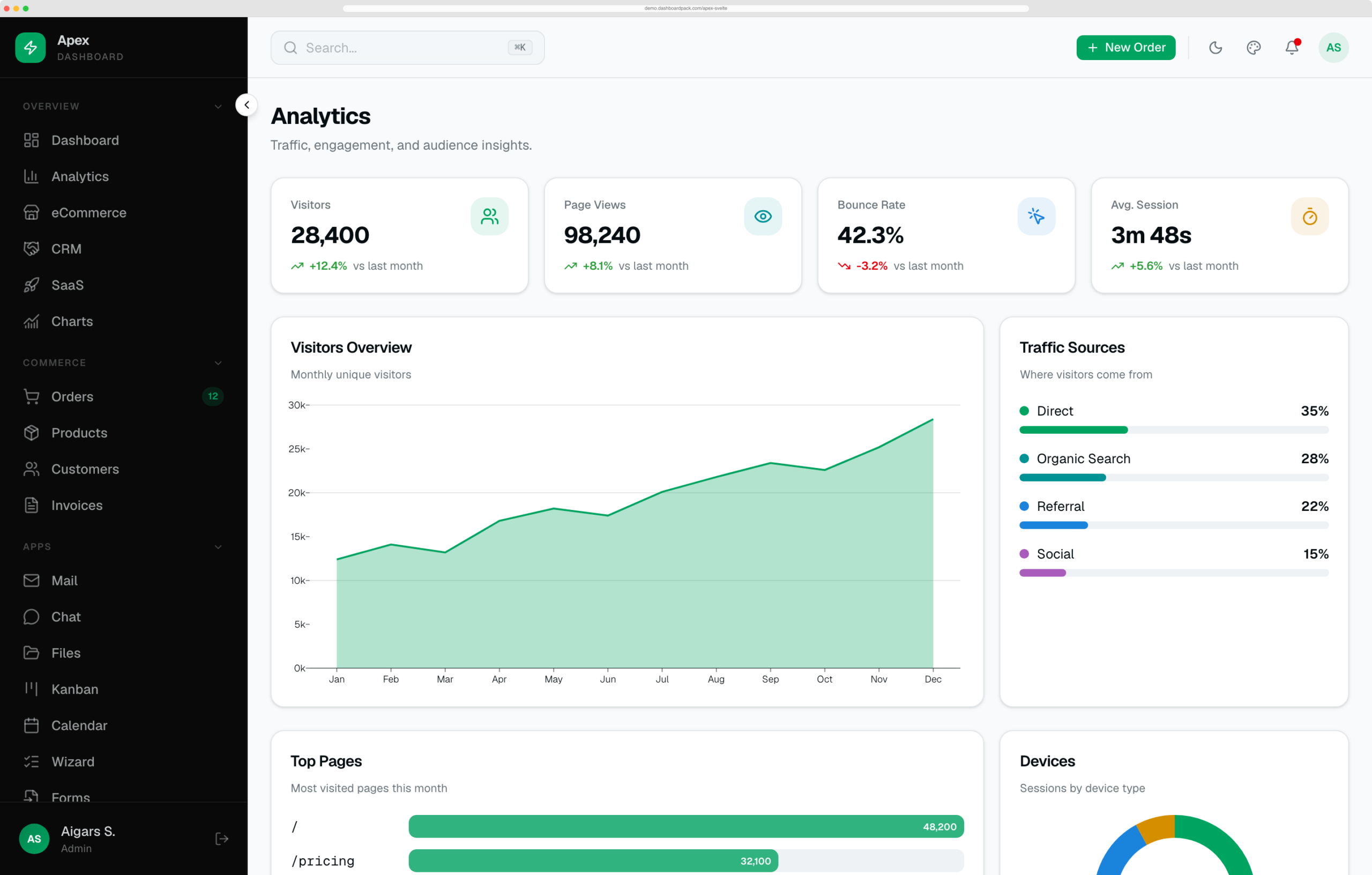
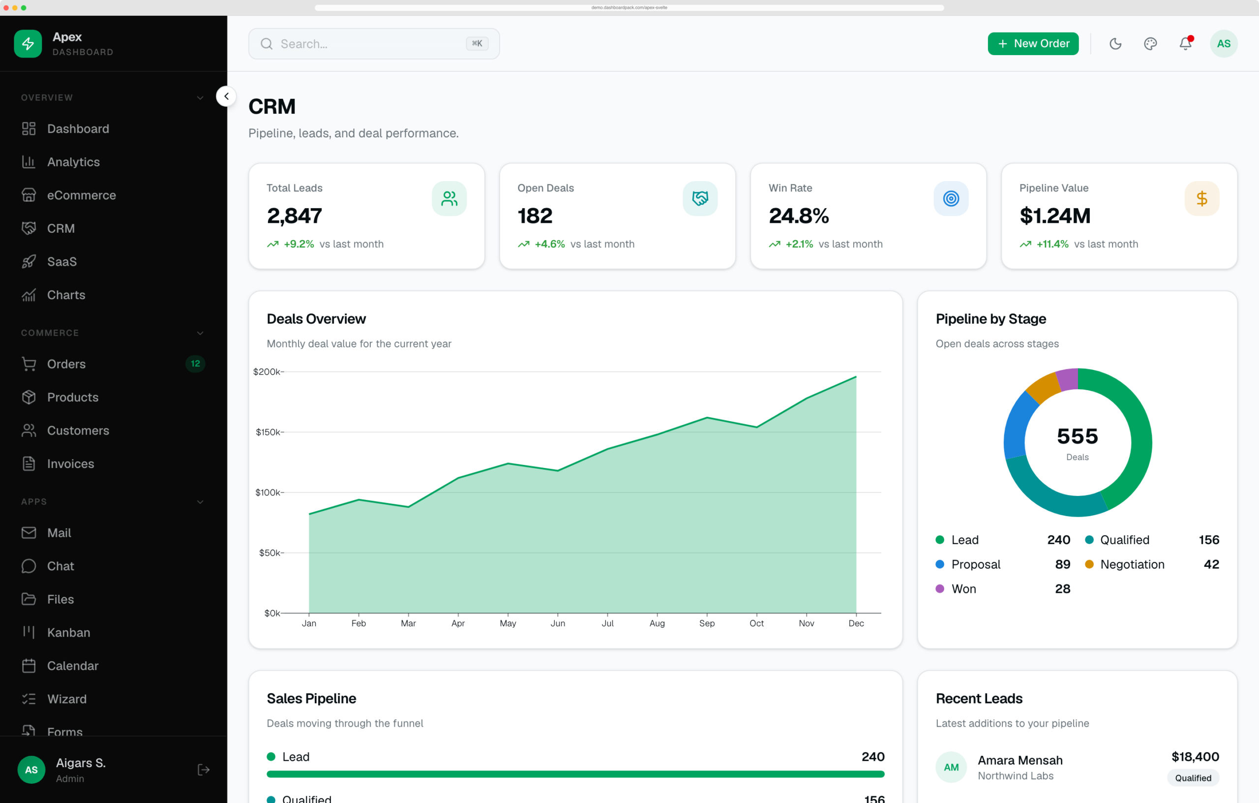
- Dashboards — Overview, Analytics, eCommerce, CRM, SaaS, and a Charts gallery
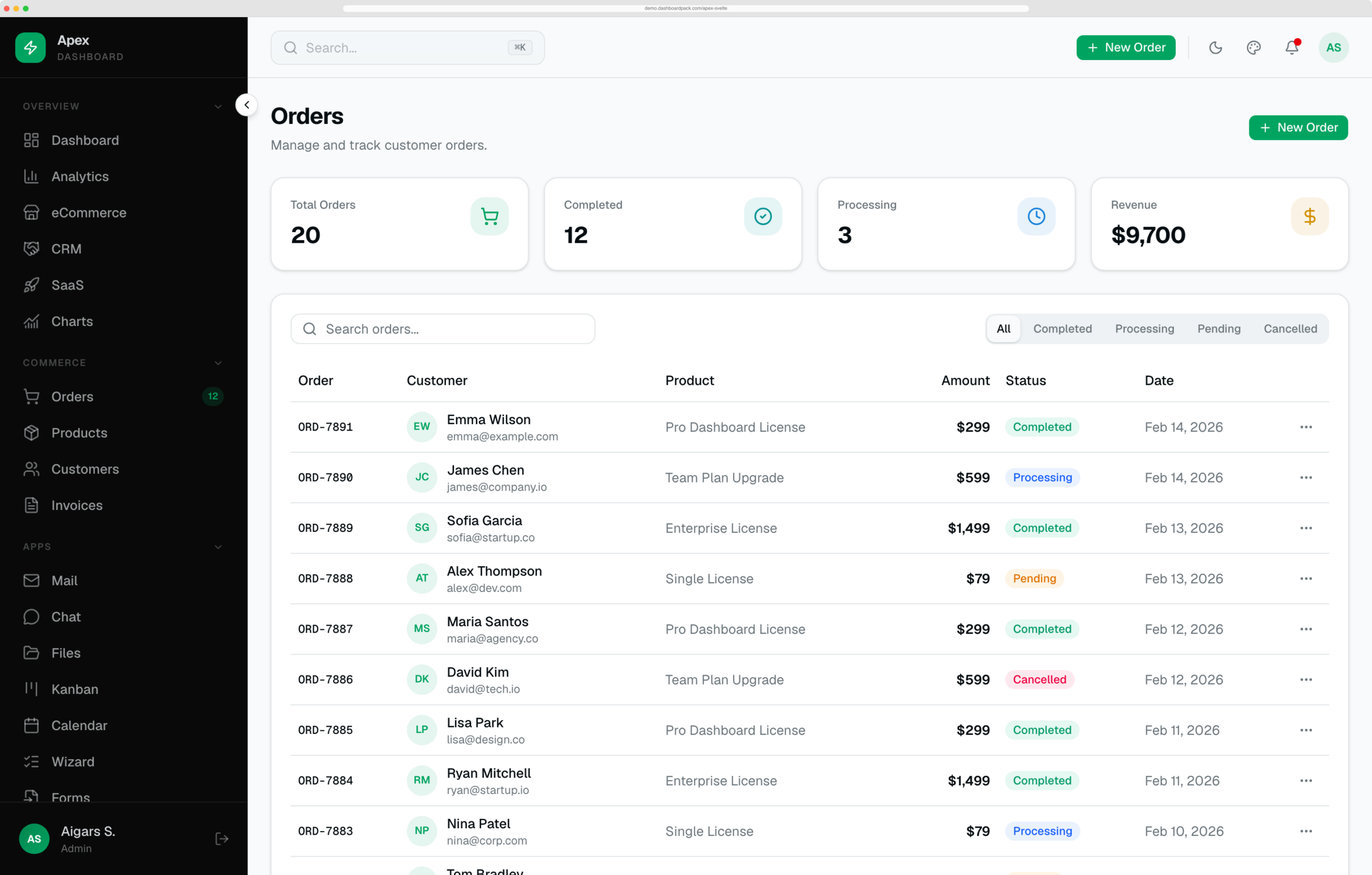
- Commerce — Orders, Products, Customers, and Invoices, each a reactive data table with search, filters, status pills, and row actions
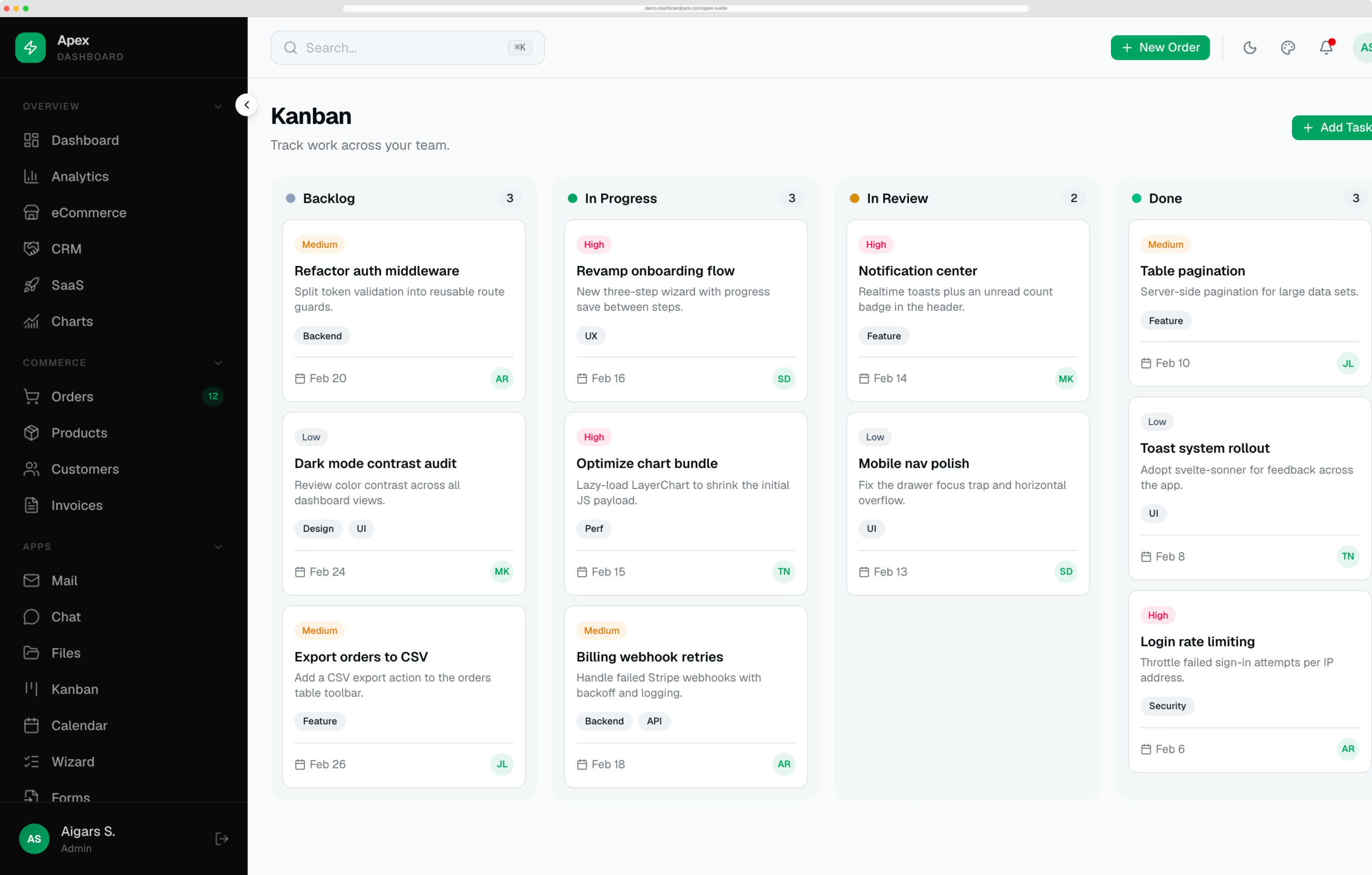
- Apps — 3-pane Mail client, live Chat, Files manager, drag-and-drop Kanban, and a month Calendar
- Forms — multi-step Wizard, a form-controls showcase, tabbed Settings, Profile, and Pricing
- System — Users & roles, Notifications, Billing, Help & Support, and in-app Docs
- Auth — login, register, forgot / reset password, two-factor, verify-email, and lock-screen
- Status — 403, 500, coming-soon, and maintenance
Interactions
- ⌘K command palette — global shortcut and header search, quick actions plus jump-to-page navigation
- Theme customizer — live accent presets, corner radius, light/dark/system, sidebar state, content width, and density; persisted to localStorage via CSS-variable overrides
- Create / edit / view modals — the New Order dialog is wired to a shared reactive store so new records appear instantly in the table and on the dashboard; connect the demo store to your backend for persistent records
- Kanban drag-and-drop — move cards between columns with live counts
- Internationalization — English, German, and French navigation labels, switchable at runtime and persisted
Design & Theming
- Tailwind CSS 4 with an OKLCH token system — semantic tokens for primary, card, muted, sidebar, chart-1…5, success, warning, and destructive
- Dark and light modes out of the box via mode-watcher, respecting system preference
- Self-hosted Geist & Geist Mono fonts, refined scrollbars, and tasteful motion
- Density modes — compact, comfortable, and spacious — driven by CSS variables
Charts
- LayerChart 2 (D3-based) area and bar charts with tabbed series, formatted axes, and themed tooltips
- Hand-rolled SVG sparklines and donut charts for exact color control and zero extra dependencies
Developer Experience
- Svelte 5 runes throughout —
$state,$derived,$effect,$props, snippets — no legacy store boilerplate - Strict TypeScript —
svelte-checkpasses with zero errors and zero warnings - Storybook — component stories for Button, Badge, Card, and StatCard with Tailwind tokens applied
- Static-deploy ready — build for any host, at the root or a subpath, with the included base-path support
- Clean architecture —
#libaliases, shared UI primitives, rune-based stores, and a typed i18n layer
Tech Stack
| Framework | SvelteKit 3 + Svelte 5 (runes API) |
| Language | TypeScript |
| Styling | Tailwind CSS 4 (OKLCH) + shadcn-svelte + tw-animate-css |
| UI primitives | bits-ui + tailwind-variants |
| Charts | LayerChart 2 (D3-based) + hand-rolled SVG |
| Icons | @lucide/svelte |
| Dark mode | mode-watcher |
| i18n | Custom rune-based locale store (en / de / fr) |
| Fonts | Self-hosted Geist & Geist Mono (@fontsource) |
| Storybook | @storybook/sveltekit |
| Build | Vite + @sveltejs/adapter-auto / adapter-static |
License: Commercial | View Live Demo
Current Release & Setup
Version 1.3.0 uses SvelteKit 3, Svelte 5, Vite 8, and TypeScript 6. Requires Node.js 22.17+ (Node.js 24 LTS recommended) and npm 11.19.1. Includes active sidebar navigation, updated setup and deployment documentation, and 42 Playwright checks at the root and a deployment subpath.
The 39 demo pages prerender for static hosting. Storybook 10.6 provides component examples. Authentication screens and sample data require your backend integration for production accounts and payments.
Pricing